What is a Geographer?
I am a professional geographer. People are often curious about what that means and what my daily work looks like, so I’m writing a short series of primers on my geography and spatial problem-solving.
Let’s start with the fundamental question:
What is a geographer?
People shape, and are shaped by, the spaces and places that surround us. Geographers study this relationship and solve problems related to space and place.
Space and place matter
Before I argue that space and place are important, let’s define them:
- Space is where we are. We can represent our location in various ways, including:
- Absolute space: our particular point on earth (X/Y/Z, latitude/longitude/height)
- Relative space: our proximity to other people, destinations, and things
- Relational space: our connectedness to other people, things, and ideas1
- Place is space given meaning by people. Our human urge to create meaning transforms our surroundings into weighty concepts like home, school, office, nature, and country.2
The spaces and places we inhabit shape fundamental aspects of our lives.
Spaces shape our health: research has shown that average life expectancy varies by about 20 years across countries of the world, counties of the U.S., and neighborhoods within a single county.3,4,5
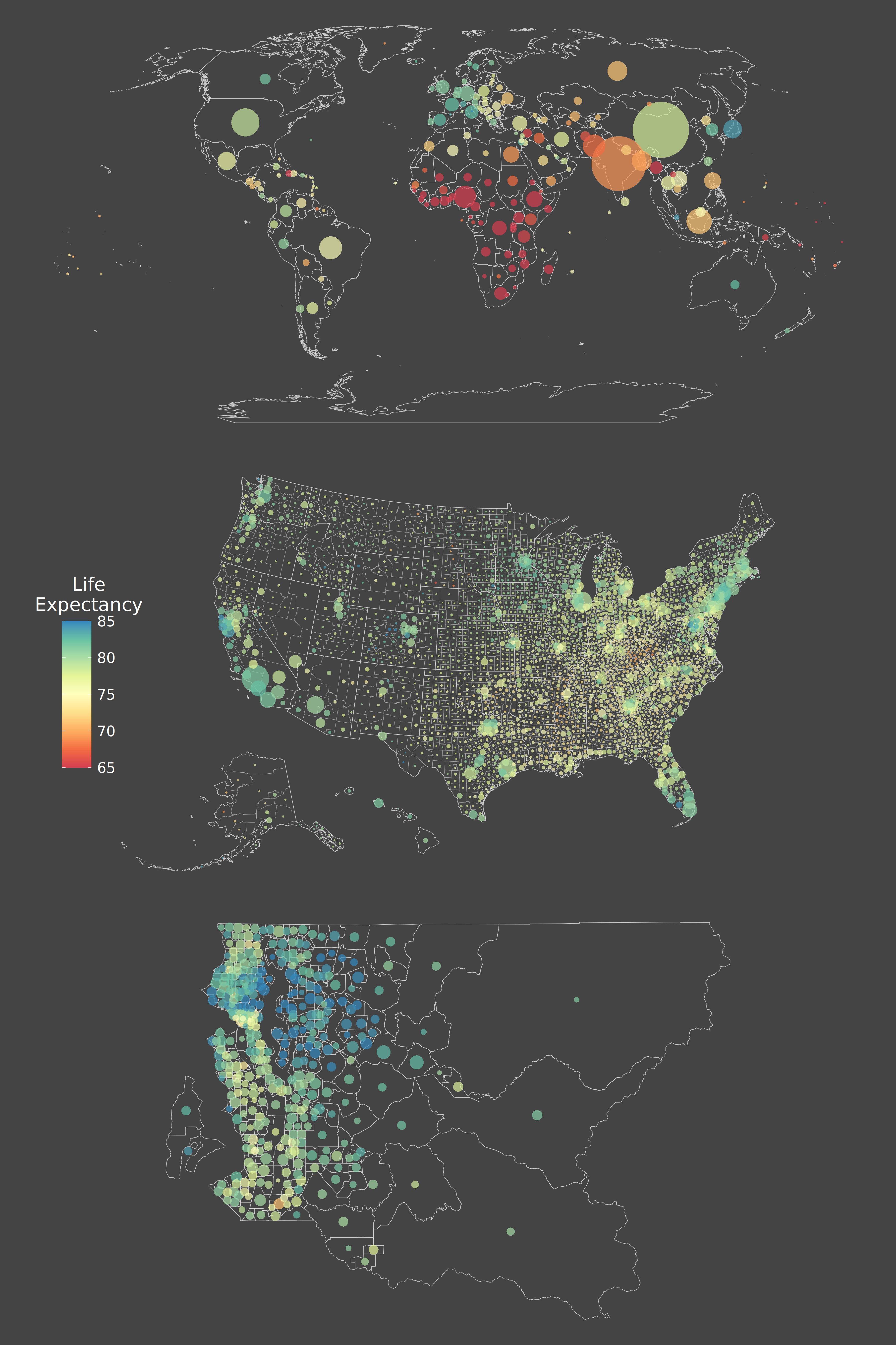 Life expectancy across countries of the world (top), counties of the United States (middle), and census tracts in King County, WA (bottom), all in the year 2014. All three maps use the same color scheme; dot size is proportional to population within each map. All life expectancy estimates are from the Institute for Health Metrics and Evaluation (IHME);3,4,5 map created by me. Credit to Dr. Laura Dwyer-Lindgren for first observing that the life expectancy gap at each of these three scales is about 20 years.
Spaces shape our life opportunities. Jane Jacobs opens The Death and Life of Great American Cities with an anecdote about Boston’s North End, a working-class neighborhood that had thrived despite violating every principle of postwar urban planning. In the face of institutional disinvestment, the North End had achieved some of the lowest juvenile crime rates, infant mortality, and rent-to-income ratios in Boston; Jacobs describes the “general street atmosphere of buoyancy, friendliness, and good health” that pervaded its streets. Jacobs’ urban planner friends bemoaned the state of the North End, while cheering the redevelopment of the neighboring West End.6
Nearly sixty years after Death and Life, a team of Stanford economists set out to map social mobility across the United States.7 By matching Americans’ tax returns to the households where they grew up, they analyzed how a child’s neighborhood and class shaped their later economic fortunes. One key outcome was adult household income for children of low-income parents (parents making the lowest quartile of household incomes in the 1980s, which was roughly $33k at the time).
Children raised in low-income West End households grew up to make an average adult income of $18k; meanwhile, their contemporaries who had been raised one census tract over, in the North End, were making an average adult income of $45k. The span of a few blocks made the difference between upwards and downwards mobility for these two cohorts.
Explore the Opportunity Atlas, the interactive map published by the Stanford economists, and you will see the same disparities repeated in city after city.
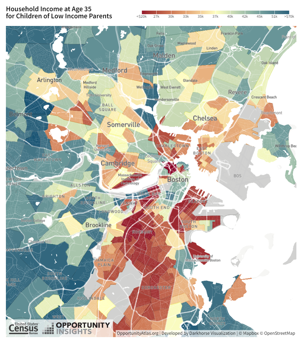 Expected household income for children of low-income parents across greater Boston, as of 2014-15. The dark red census tract directly above the label for Boston is the West End; the blue census tract neighboring it to the northeast is in the North End. Source: Opportunity Atlas.
Space shapes how we navigate the world. We are far more likely to walk, bike, or take public transit to a destination when we expect the journey to be convenient, safe, and comfortable.8 Those expectations aren’t consistently met across American cities, leading to differences in travel preferences:
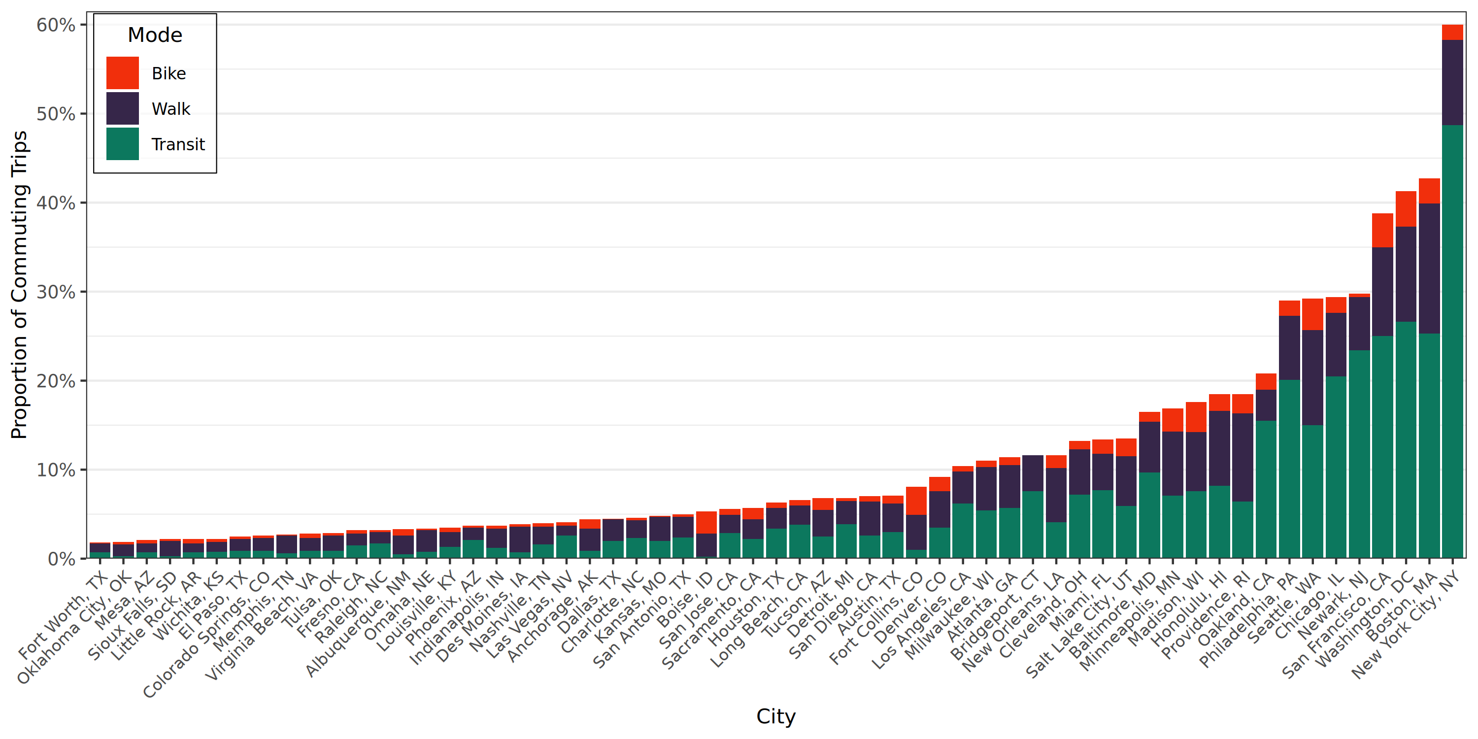 Proportion of commuting trips made by walking, biking, or taking public transportation across 59 large US cities. The proportion of commuting trips from these three modes ranges from 2% (Fort Worth) to 60% (New York City). Source: U.S. Census Bureau, 2024 ACS 1-year estimates.
Space also governs our relationship with the environment and climate. On average, households in suburban and exurban areas emit substantially more carbon dioxide than households in dense urban areas.9
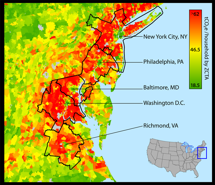 Estimated carbon footprint per U.S. household by ZIP code tabulation area (ZCTA) as of roughly 2013, highlighting east coast cities. Source: UC Berkeley CoolClimate Network
Maybe you have some follow-up questions: How do we know these inequalities are real and meaningful? Is space responsible for these differences, or is it just a proxy for other social forces? How do these maps translate into people’s daily lives? And what can be done about all this?
If you asked any of those questions, congratulations! You’ve taken the first step towards becoming a geographer.
What geographers bring to the table
As experts in spatial reasoning, geographers work to understand and solve problems with a spatial dimension. Most geographers have “spiky” expertise, with a broad knowledge of geographic concepts as well as expertise in a few subfields. Those subfields include:
- Human geography: studying the social, cultural, and economic elements of our interactions with space and place
- Physical geography: studying human-environment interactions
- Geographic information science: deriving information from spatial data and algorithms
- Spatial statistics: quantifying relationships and causation for processes where location matters
- Transportation: spatial logistics informing the movement of people and goods
- Place-making: understanding how people ascribe meaning to places
What about maps?
Maps are important tools for spatial reasoning and communication. Most geographers will be expert map interpreters, and many have experience in another geographic subfield:
- Cartography: the study of mapmaking and spatial data visualization
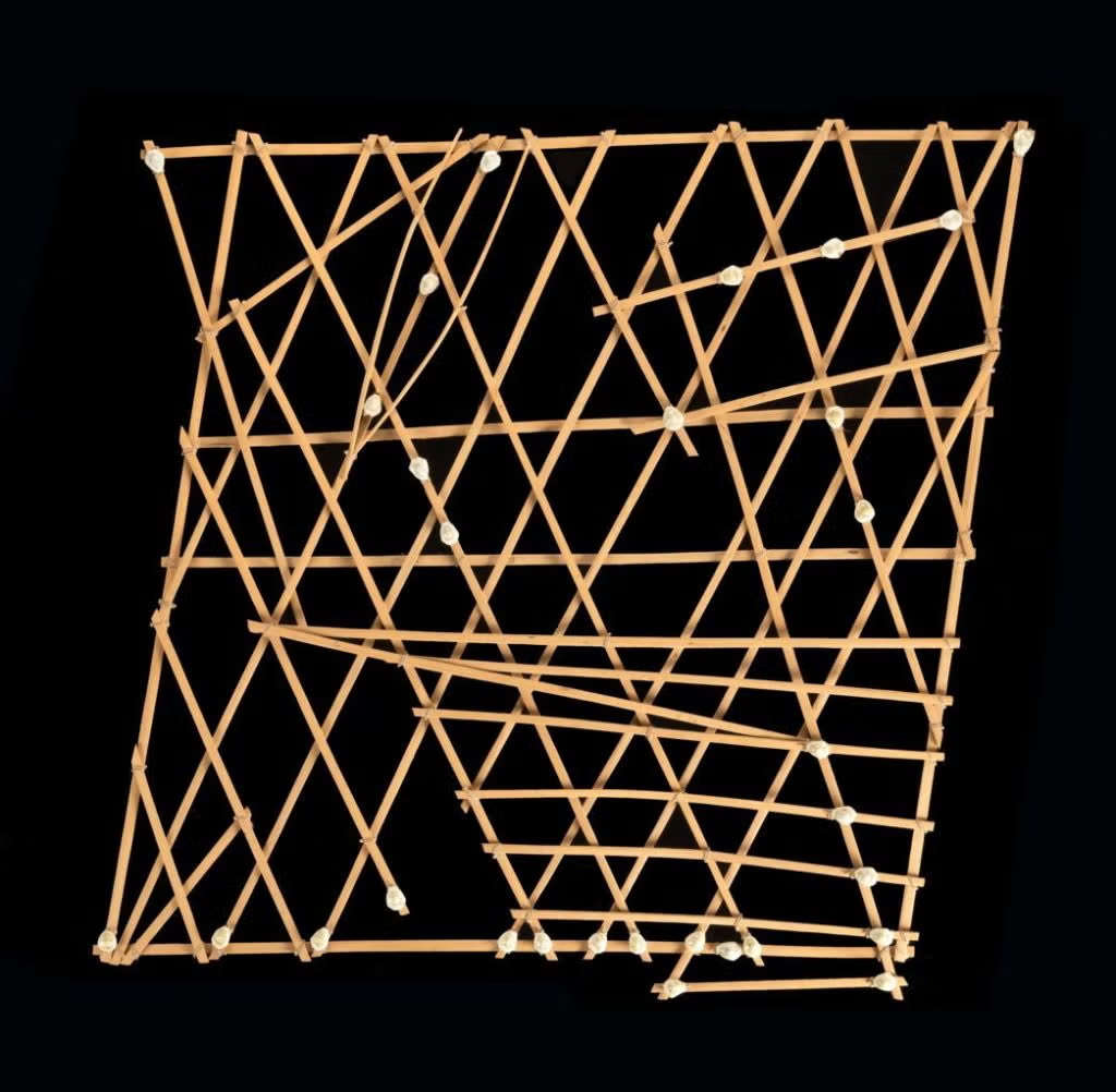 A rebbelib chart used by Marshallese sailors for navigating ocean currents.
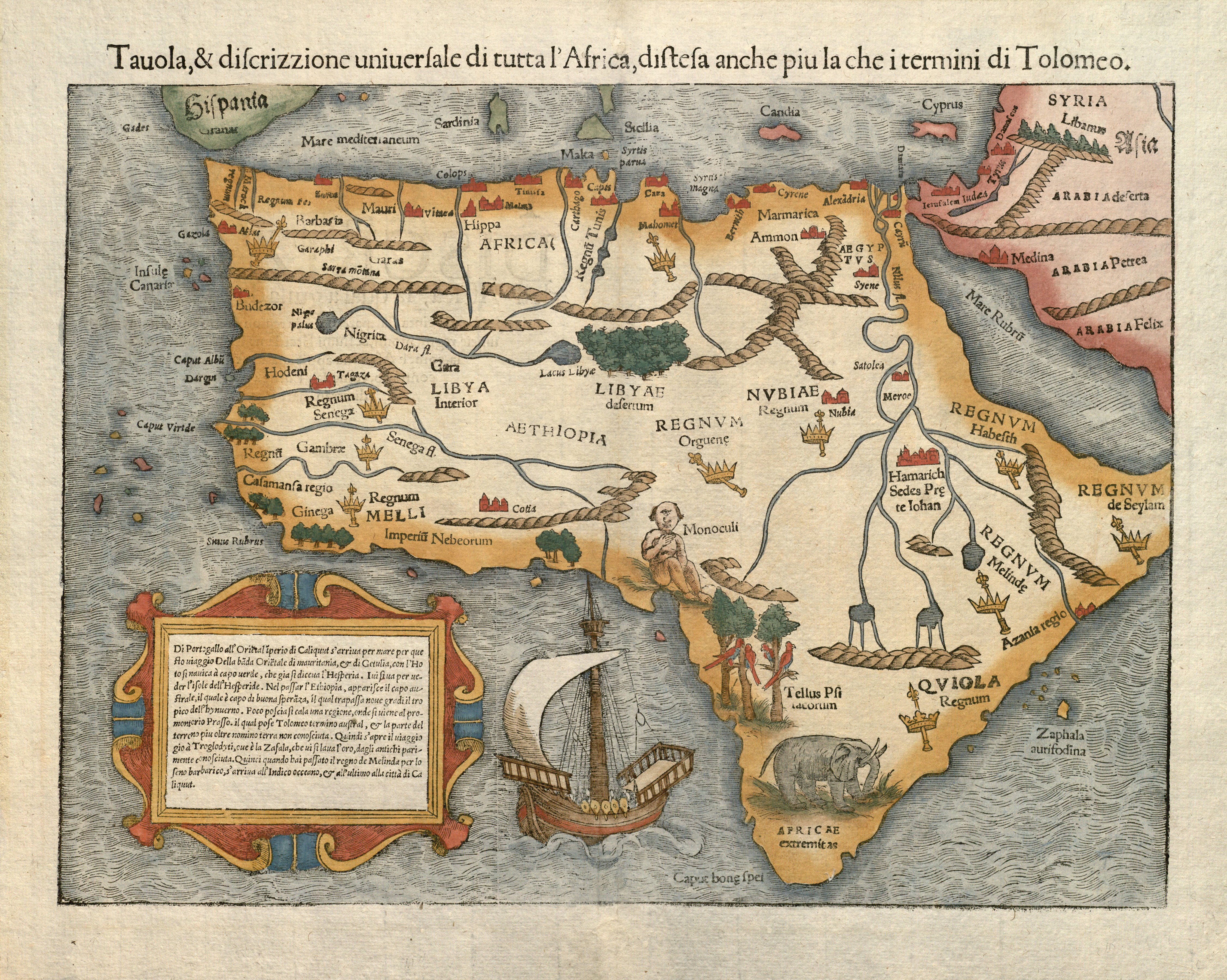 The first known map to show the entire African continent, published by Sebastian Münster in 1554. This map helped early European sailors to navigate around the horn of Africa to the Indian Ocean: the text inset describes a sailing itinerary from Portugal to Calcutta.
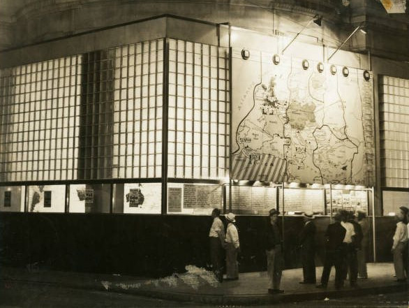
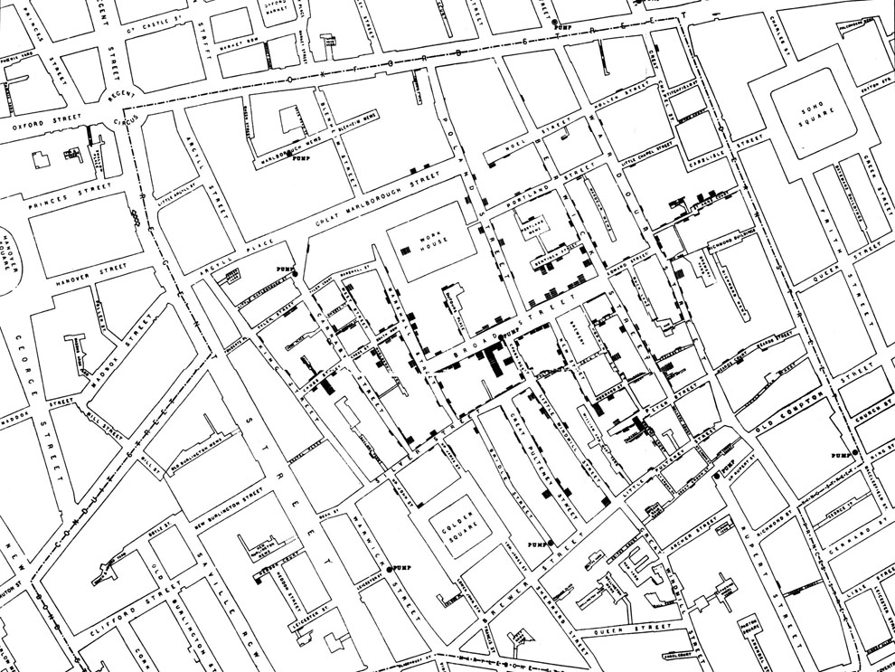 A map of cholera deaths in London’s Soho neighborhood, created by Dr. John Snow during the 1854 cholera epidemic. Each recorded death is displayed as a stacked bar at the address of the deceased. This map convinced city officials of Snow’s theory: contaminated water from the Broad Street public water pump, at center, was transmitting cholera to the neighborhood.10
Maps can be informative and visually stunning, but they are just one of the building blocks that make up spatial reasoning. Maps demand interpretation: to a careful observer, a well-made map can sometimes clarify a problem or suggest a possible solution. However, map readers also need to be wary of the pitfalls that come when the complexities of the real world are collapsed onto a page or screen. An expert geographer marshals other forms of spatial knowledge to understand a map while also keeping in mind its limitations.
Conclusion
Now that you’ve read this post, I hope my detailed job description makes more sense: I am a quantitative human geographer studying how spaces and places shape health, mobility, and access to opportunity.
In future posts, I’ll share my tools of the trade and highlight how geographers can provide value to governments, businesses, and advocacy groups.
Notes
[1] For a primer on space, see: David Harvey’s Space as a Key Word (2004).
[2] For more on the distinction between space and place, see Tim Cresswell’s entry for "Place" in the International Encyclopedia of Human Geography (2009), or Place: An Introduction (2004).
[3] National life expectancy estimates from: Schumacher, A. E., et al. (2025). Global age-sex-specific all-cause mortality and life expectancy estimates for 204 countries and territories and 660 subnational locations, 1950–2023. The Lancet, 406(10513), 1731-1810. doi:10.1016/S0140-6736(25)01330-3
[4] County life expectancy estimates from: Institute for Health Metrics and Evaluation (IHME). United States Mortality Rates by Causes of Death and Life Expectancy by County, Race, and Ethnicity 2000-2019. Seattle: IHME, 2023. doi:10.6069/3WQ2-TG23
[5] Census tract life expectancy estimates from: IHME. United States - King County, Washington Life Expectancy and Cause-Specific Mortality by Census Tract 1990-2014. Seattle: IHME, 2017. Study doi:10.1016/S2468-2667(17)30165-2
[6] Jacobs, J. (1961). The Death and Life of Great American Cities. Random House. For details on Boston’s North End, see Introduction pp. 8-11.
[7] Chetty, R., et al. (2026). "The Opportunity Atlas: Mapping the childhood roots of social mobility." American Economic Review, 116(1), 1-51. doi:10.1257/aer.20200108. See also https://opportunityatlas.org/
[8] For more, see: Speck, J. (2013). Walkable City. Macmillan.
[9] Jones, C., & Kammen, D. M. (2014). Spatial distribution of US household carbon footprints reveals suburbanization undermines greenhouse gas benefits of urban population density. Environmental science & technology, 48(2), 895-902. doi:10.1021/es4034364. See also https://coolclimate.org/maps
[10] For a nuanced discussion of Snow’s map, see: Tufte, E. R. (1997). Visual and statistical thinking: Displays of evidence for making decisions.